


To inform & delight
Milton is Glaser is a well-known graphic designer and he is famous for creating “I ♥ N.Y. logo”. He actually created that logo one day inside of a cab in New York. The logo helped reverse the decline and boost moral when New York City was widely perceived as danger zone. Glazer is about to tuen 80 and he is still designing. He has been designing at same office since 1965. His office is right next to an elementary school. Glaser said, we need to operate by interruption.
Food plays important role in his design because food is nurture, and shows generosity.He loves to teach others and desire to influence other’s lives. Advice he can give is whatever you learn take it to next project. During an interview he was asked to give advices for the young artist: it's a tough business, you have to be amazingly consistent and persistent. you have to work like hell. you cannot become an excellent practioneer without constantly working hard all your life. it is not an easy way to earn your money. you have to be well trained and you have not to be narrow to references, because everybody else is doing that at the same time. the richness of understanding comes from the deep historical, philosophical idea. Glaser said an inspiring statement that stick with me, which was “graphic designers have access to peoples mind and find something in common with each other. Social commentary and coexistence is important in his designs because that creates less likely to have war between each other. I like his positive ideas.Glaser’s work is everywhere logos, New York magazine, posters, restaurants, and super markets. He won a life time achievement award and received National Medal of Arts by President Obama in 2009.
http://movies.nytimes.com/2009/05/22/movies/22glas.html
http://www.hillmancurtis.com/index.php?/film/watch/milton_glaser/
http://www.designboom.com/eng/interview/glaser.html


Reference:
Shephard Fairey’s happy accident turned into something great. He is a contempory artist and graphic designer who take much interested in politics. He makes T-shirt and he is a consumer. He can fit into many categories but he refuses to pin down on certain category. He creates iconic images and his art is everywhere; Street signs, on walls and urban areas. They are everywhere in London, New York, L.A. etc.
He has inspired many graphic designers, street artists. His techniques are simple and effective.
His starting point with the Andres the Giant was spontaneous but had great reactions. His work pops out because he breaks boundaries, and some are mysterious. His work gives energy in public space. Some of his designs are purposely created to provoke questions.
He does not just create attractive artwork but his artwork serves some sort of purposes. He uses art for politics, critique capitalism, also supports certain political leader. Some of his work can work as paper bomb. His images can effect viewers’ emotions and persuade one’s thinking. I admire artist whose work is powerful and have effects on people. One thing that stood out to me the most what Shepard said was a lot of people can make powerful work but people fear to cross over their categories. For example thinking that people won’t take a graphic designer seriously when he/she decide to do studio art. So if we want to be a great artist we cannot hold back. Also stuck in silly categories. People who are passionate about something then they will improve. So instead of just pondering the ideas we should just do it because action is more important.


Bing had a great influenced on a movement of Art Nouveau. Bing was very much influenced by Japanese art. Bing collected Japanese art and promoted Japanese art to his fellow artists. Bing liked Japanese patterns, organic and free feel about Japanese art. Through his influence of Japanese art his influence Art Nouveau movement that lasted from 1890 to 1905.Art was not seeing only on walls or art museum during art nouveau it was more about seeing art all around you. This art movement was making art part of everyday life.
Most of art from Art nouveau are highly decorative and curvilinear and have organic feel to them. Although this movement was liked by many people not everybody liked it. Some thoughts they were overly decorative, cheap and they did not care for it too much.
I personally like art nouveau very much. I think a lot of artwork from the movement was interesting. Most of them are famine, organic, creative and decorative which I personally like. I love Mucha’s paintings of curvy body and hair because they are elegant and classy. Also suggest great movement of body. Also architect Antoni Gaudi’s work Barcelona is very amazing and breath taking. The details he put into this architecture piece is so interesting and creative. There were also people who were creative with interior designs, furniture design also jewelry designs. Tiffany lamp is a great example of art Nouveau. It is decorative art and it can be pat of everyday life. It has multiples of colors and has organic feel to them.
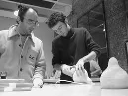
I was very fascinated with how designers/engineers come up with new ideas to make objects better and more comfortable. They don’t just come up with an idea and make it right away but it takes time and process.
When I used to think of word design I thought of it as making things appear attractive, neat and useful. However I have learned that design is an instrument of organization, and it must perform in response to human needs. It is an urgent requirement and finding the best solution to a problem. For an example potato peeler used to be metal but to make it more comfortable grip a designer came up with an idea to make the potato peeler handle from bicycle handle for comfortable grip. That really helped people with arteries. Product design is efficient and effective generation and development of idea through process that leads to new products. Designers and engineers are always looking for new ideas, new shapes to work with and search for things to make objects even better. It was inspiring to hear that there are designers trying to make things easier and more comfortable for people who are in not so good conditions such as people with physical and medical issues. They are the ones who are in needs things to be more convenient and comfortable than normal people. One designer said every object tells a story if we know how to read it. Good design doesn’t look too complicated rather they are simple and easy to operate. For example, Apple Company how their products have very simple and clean looks to it. Also it is simple to use and convenient. Through good designed products they improve our daily life. Good designed objects are not only useful and comfortable but things that will last long. Objects we can give to our next generation.


Through different typefaces the same messages can deliver in different ways because typefaces have expression, color, and motion. There are races and families in typeface. For example there are six types of race and they are: black letter, sans serif, roman (old style), square serif, script and novelty. Over the time typeface gradually got bigger, less serif and less decorative for legibility. Within this race there are typeface families. For example Universe, Gil Sans, Futura, Arial and Halvetica are all in San Serif group. They don’t look just like but they share similar characteristics. For an example this group they all don’t have serif. Halvetica was born in Switzerland in 1957. Designed by Max Miedinger with Eduard Hoffmann. Most of the typefcaces were named after whoever designed the fonts but Haveltica means the Swiss typeface. Halvetica is rational, neutral, simple, clean and efficient. Halvetica did not become popular until twentieth century. San serifs have heavier stems and uniform stroking they have excellent legibility. Halvetica can be used for almost every purpose. Most traffic signs, street names, interstate sign are done in san serifs and mostly Halvetica. Also it is widely used in newsletter, posters, packaging, and websites.
Now that I am taking Typography I take much more interested in different typefaces. I’ve grown to like Halvetica. I like the simple and clean look of Halvetica and I like how this typeface deliver message as well. I think it has sincere and intelligent feel to it. It is so interesting how typefaces can set mood of the story or document we are about to read. Also through taking publication of design I’ve learned how important it is for typeface to match the concept/content of designs. A typeface plays quiet interesting and important role!